Brand assets and usage guidelines
Here you will find the assets used throughout the Cascade ecosystem. This also includes how to use the logo, colors, visual language, fonts & assets.
What you’ll find here.
What you’ll find here.
Much of the content and material download is for approved partners and employees of Promotino only. If you are not an approved partner or employee of Promotino, you cannot use this material without our express permission. There are some assets available for press and media, but we must insist you advise us of its use prior to publication.
If you have any questions not covered in these guidelines or would like additional content and information, please contact [email protected].
Logo
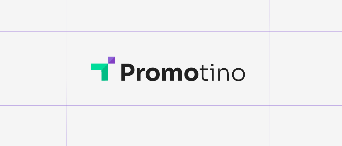
Our logo is a combination of the geometric shapes for arrow for "promote" and a rectangle for "next level". The typeface used for the logotype is Sora, which was chosen for its usage in empowering projects that benefit society. Simple, clean with vibrant color combination.
Where possible, you should use the whole logo, text, and icon. If using on a dark background, there is a white logo available.


Logo Safe Zones
You should determine the ‘safe zone’ for the logo by positioning the icon as below. Always give the logo some breathing space – don’t crowd it with other visual elements.

Logo Misuse
There are several ways to not use the logo, including stylistic treatments.
Color
Dark orchid, green, dark pastel purple and caribbean green are the dominant colors for our brand. Want a highlight? We have a secondary palette for graphs, charts, diagrams, etc. There is also a third set of colors for those nice pale backgrounds you will see around our website, ads, and socials. Careful when using our colors; ensure you use the correct variations and only where appropriate. When in doubt, reach out to the marketing team.
#823FC4
DARK ORCHID
RGB: 130, 63, 196
#00BC84
GREEN
RGB: 0, 188, 132
#8E64D6
DARK PASTEL PURPLE
RGB: 142, 100, 214
#00DC9A
CARIBBEAN GREEN
RGB: 0, 220, 154
Secondary Shades
This is our secondary palette used in graphs, charts, diagrams, text, etc.
#FEE75C
CORN
RGB: 254, 231, 92
#F5F5F5
CULTURED
RGB: 245, 245, 245
#B2B2B2
PHILIPPINE SILVER
RGB: 178, 178, 178
#161616
CHINESE BLACK
RGB: 22, 22, 22
Fonts and Typography
Promotino brand used the main font for the logo named Sora. Sora is a sans-serif typeface, which means sky in Japanese. It was commissioned for the Sora decentralized autonomous economy focused on empowering projects that benefit society.
Our secondary font is the sans-serif Noto Sans.
AaBbCcDd123 !@#$%&?”{}
Poppins Semi-bold
Perfect for headings, all great and small. If you want to make a statement with, for, or about Cascade, this is the font for you
Poppins Medium
ABCDEFGHIJKLMNOPQRSTUVWXYZ 1234567890!@#$%^&*()-_=+{}][:;”’/?.>,<`~
abcdefghijklmnopqrstuvwxyz
Poppins Regular
ABCDEFGHIJKLMNOPQRSTUVWXYZ 1234567890!@#$%^&*()-_=+{}][:;”’/?.>,<`~
abcdefghijklmnopqrstuvwxyz
AaBbCcDd123
!@#$%&?”{}
Noto Sans
Perfect for headings, all great and small. If you want to make a statement with, for, or about Cascade, this is the font for you
Poppins Medium
ABCDEFGHIJKLMNOPQRSTUVWXYZ 1234567890!@#$%^&*()-_=+{}][:;”’/?.>,<`~
abcdefghijklmnopqrstuvwxyz
Poppins Regular
ABCDEFGHIJKLMNOPQRSTUVWXYZ 1234567890!@#$%^&*()-_=+{}][:;”’/?.>,<`~
abcdefghijklmnopqrstuvwxyz
Brand Imagery
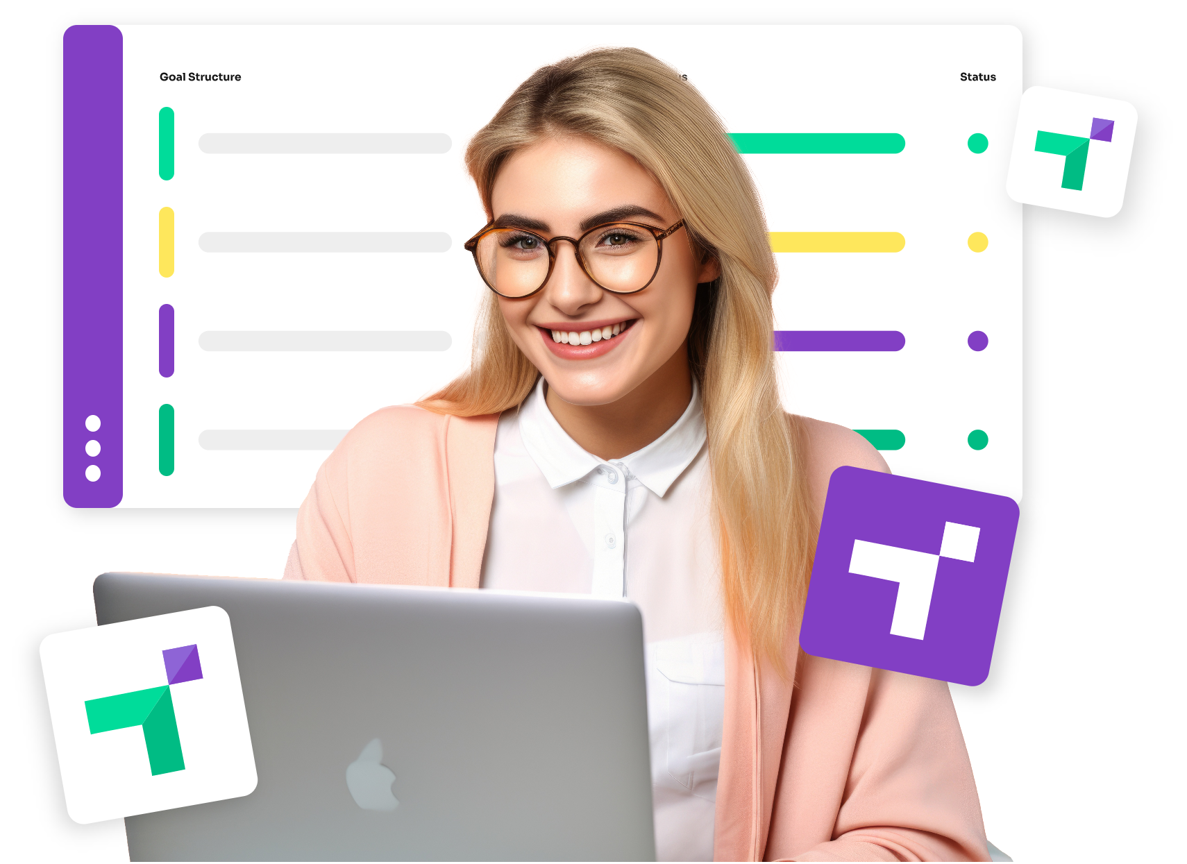
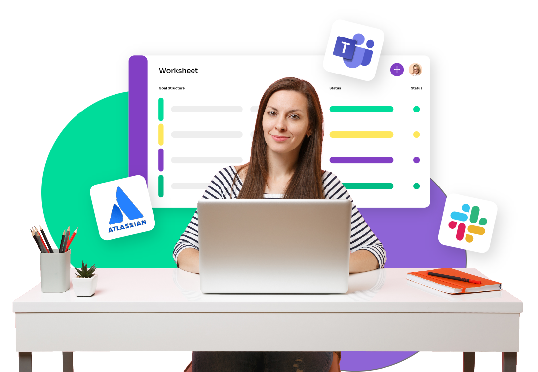
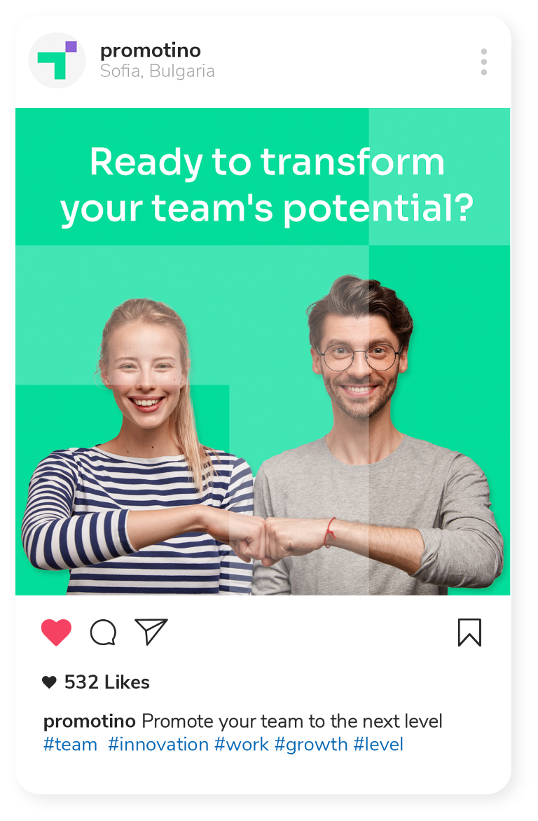
Promotino purpose is to help people and teams thrive with the solutions and services we provide. We demonstrate this by using imagery that focuses on people and teams pursuing what's important to them. Our imagery often merges photography with interface design and other visuals elements such as logos and icons. This allows us to take complex concepts and present them in a more interesting way.

Social Media
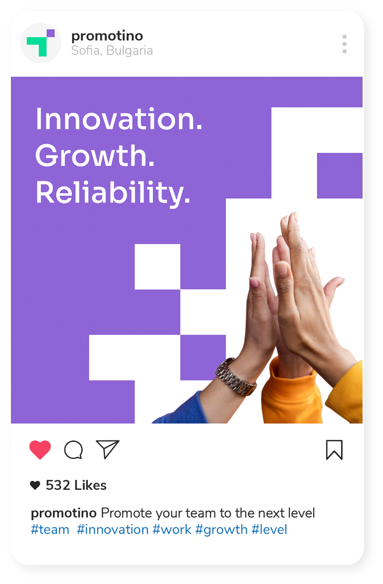
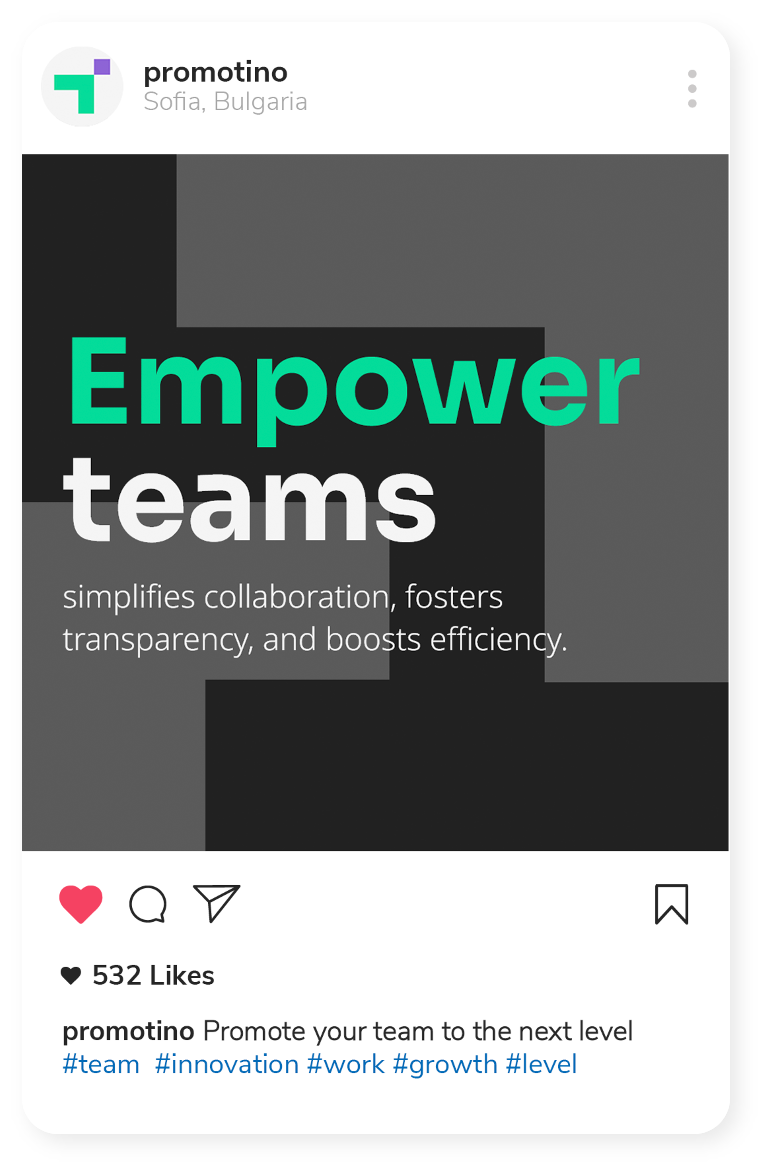
Our social media presence consists of fresh and eye-catching visuals combining again the human factor, which represents the thriving company team, and some of our brand elements such as the logo and its components.
Presentations & Documents
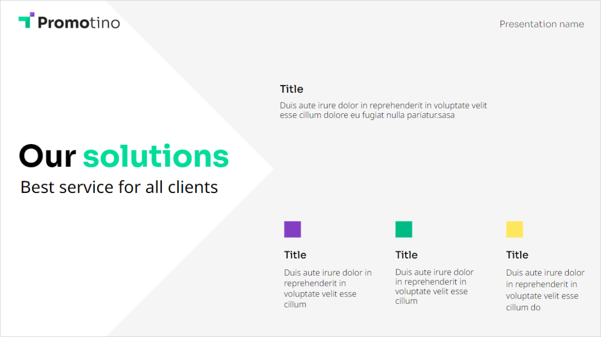
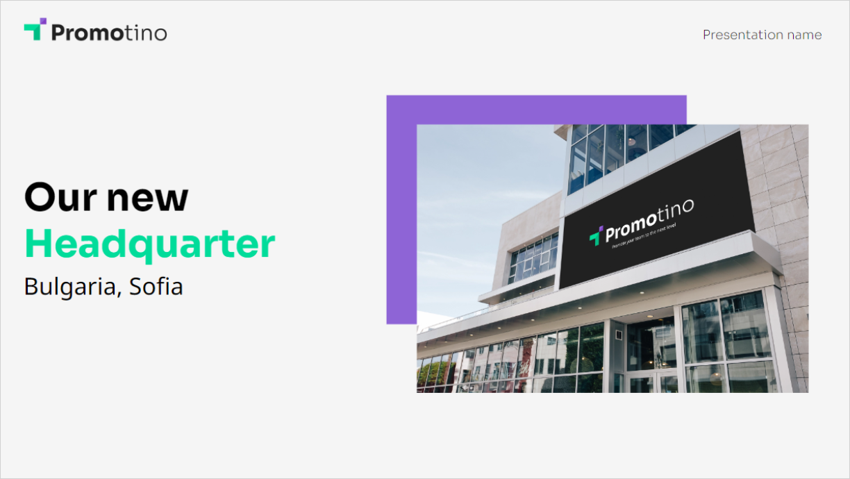
Presentations are the workhorse of the corporate world. They’re one of the most frequently used forms of communication. So, we’ve spent a lot of time making some that aren’t just quick and easy to use – they’ll knock your client’s socks right off.
